
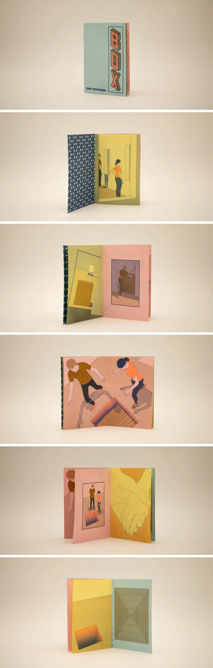
In his latest project, The Box, Eric Petersen delves into the tangible and tactile world of Risography, a medium that contrasts with his usual digital precision yet complements his overarching artistic vision. Known for his minimalist, instructional graphic-inspired style, Petersen experiments with a three-color, 8-page RISO zine that marks a significant departure from purely digital illustration, inviting the viewer into a printed realm where each page vibrates with texture, color, and narrative intrigue.
The Risograph Medium: An Experiment in Print
Petersen’s venture into Risography reflects a desire to explore new visual languages while retaining his signature aesthetic. The medium itself—a semi-analog printing technique popular for its unpredictability and unique texture—provides the perfect foundation for this experiment. Risography’s limitations are integral to the work’s character; its layering of colors (fluorescent orange, gold, and federal blue) gives the zine a vibrancy and tactile depth that could not be achieved through digital printing. These choices of ink, applied to pastel-colored paper (blue, yellow, and pink), underscore the juxtaposition of mechanical precision and human imperfection that characterizes both Risography and Petersen’s artistic practice.
A Story Told Through Design
The Box, though subtle in its narrative, embodies a thematic focus consistent with Petersen’s body of work. The story, centering on the delivery of a mysterious box, is less about plot than it is about mood. Petersen’s characters, defined by their blank expressions and situated in stark, almost sterile environments, inhabit a world where empathy is elusive but deeply sought. The zine’s deliberately cold, instructional aesthetics echo this thematic void, inviting readers to project their own emotions and questions onto the pages.
Each double-sided spread plays with contrast: the mechanical linework of the characters and objects set against the organic misregistrations and ink overlays inherent to Risography. The clashing fluoro-orange, deep blue, and metallic gold create a dynamic yet unsettling atmosphere as if the colors themselves hint at the internal tension of the characters. The choice to leave much of the narrative ambiguous allows the viewer to linger, not on the resolution of the story, but on the emotions it evokes.
Stylistic Continuity and Innovation
Born in Santa Monica, California, and now based in Albuquerque, New Mexico, Petersen’s artistic journey has been shaped by his West Coast education and ongoing exploration of diverse artistic techniques. His previous works—primarily digital, precise, and inspired by video game aesthetics—have been featured in numerous prestigious publications and institutions, from The New York Times to Scientific American. However, his shift to Risography represents both a technical and conceptual evolution, as he integrates the analog warmth of printmaking with the calculated simplicity of his digital roots.
Petersen’s work often straddles a fine line between the clinical and the emotive. His characters, frequently expressionless and locked in geometric compositions, invite viewers to engage in a dialogue about emotional detachment, isolation, and the human condition in the digital age. In The Box, this stylistic detachment is deepened by the nature of the Risograph process. The ink’s inherent inconsistencies—the imperfections that come with the analog process—contrast with the machine-like precision of Petersen’s illustrations, creating a tension that reflects the emotional ambiguity of his characters. They exist in a world that is at once vividly tactile yet emotionally distant.
A Reflection on Empathy and Process
For Eric Petersen, art is a means to spark empathy and self-reflection. His minimal environments serve as blank canvases for emotional projection, asking viewers to find meaning in what is left unsaid. The decision to use Risography for this project amplifies this tension between presence and absence. The box at the center of the zine’s story may symbolize the unknown or the unspoken emotions we carry—sealed, delivered, yet never truly understood. In this way, the medium becomes the message: just as Risography leaves traces of human error in every print, so too does Petersen’s story leave traces of unresolved emotion.
Eric Petersen’s The Box is not merely an experiment in printmaking; it is an exploration of narrative form, emotional resonance, and the tactile experience of art. His use of Risography adds a new dimension to his exploration of empathy and detachment, drawing viewers into a physical, yet abstract, encounter with his characters and their world. This project reminds us that in both art and life, the most profound stories are often told in the spaces between precision and imperfection.
All images © by Eric Petersen. Don’t hesitate to find other inspiring work in the Art and Illustration categories on WE AND THE COLOR.


